
In a world where smartphones practically function as an extra limb, a clunky, unresponsive mobile interface is the quickest way to lose users. Whether you’re a startup or a seasoned business, getting mobile UI/UX right isn’t optional—it’s essential.
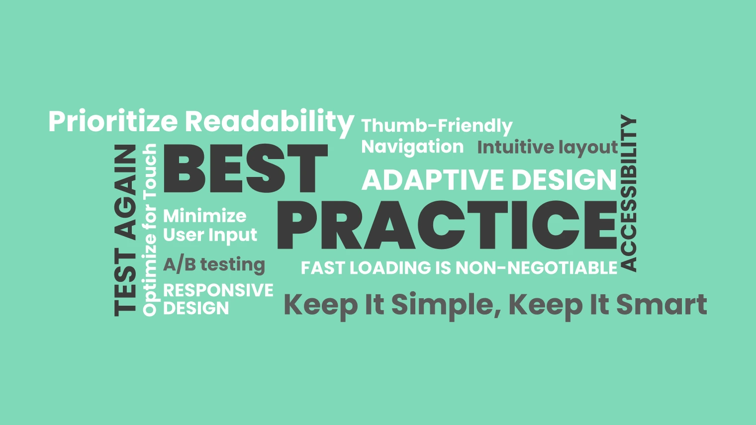
So, how do you ensure your mobile design is smooth, engaging, and frustration-free? Here are eight best practices to keep in mind.
Less is more when it comes to mobile design. Users don’t want to wade through cluttered screens or unnecessary elements. Prioritize essential features, use whitespace wisely, and maintain a clean, intuitive layout.
Simplicity enhances usability and improves navigation, ensuring that users can quickly find what they’re looking for without unnecessary distractions.
Another crucial aspect of simplicity is consistency. Stick to a uniform color scheme, typography, and design elements across the entire app or website. This creates a seamless experience that feels intuitive and familiar.
Unlike desktops, mobile users navigate with their fingers, not a precise mouse. That means buttons, links, and interactive elements should be large enough to tap comfortably. Stick to a minimum touch target of 48px by 48px for a frustration-free experience.
Additionally, avoid placing interactive elements too close to one another to prevent accidental clicks. A well-spaced interface reduces errors and enhances overall usability.
Gestures, such as swiping and pinching, can also enhance user interaction. Implementing intuitive gesture controls makes navigating the app or site feel more natural and responsive.
A mobile-friendly interface should adapt seamlessly to different screen sizes and resolutions. Whether a user is on a compact smartphone or a large tablet, your UI should look and function flawlessly. A trusted UI/UX agency can help ensure your design adjusts perfectly across devices.
Using a mobile-first approach in design ensures that critical elements remain accessible and functional, even on smaller screens. Prioritizing mobile design before scaling up to larger screens helps create a more adaptable and user-friendly experience.
Speed is everything. If your mobile site or app takes more than a few seconds to load, users will abandon it. Compress images, minimize code, and leverage caching techniques to keep things running fast and smooth.
Lazy loading can also improve performance by only loading images and content as needed, rather than all at once. This reduces the initial load time and provides a smoother browsing experience.
Another strategy to improve speed is using a Content Delivery Network (CDN). A CDN distributes content across multiple servers worldwide, ensuring that users can access the app or site with minimal delays.
Nobody likes squinting at tiny text. Use legible fonts, maintain a comfortable contrast ratio, and ensure that text scales appropriately on all screen sizes. A general rule? Stick to at least a 16px font size for body text.
In addition to font size, line spacing and paragraph structure are equally important. Proper spacing makes reading easier and more pleasant. Avoid long blocks of text and break up content with headings, bullet points, and visuals to improve readability.
Dark mode support is another usability feature that enhances readability. Allowing users to switch between light and dark modes improves accessibility and caters to personal preferences.
Most people use their phones with one hand, relying primarily on their thumbs. Design navigation elements so they are easily reachable—think bottom navigation bars instead of hidden menus at the top of the screen.
Another thumb-friendly approach is to position key interactive elements within the “thumb zone.” The thumb zone refers to the areas of the screen that are easiest to reach with a natural grip. Placing frequently used buttons and controls within this area enhances usability.
Hamburger menus, while common, should be designed thoughtfully. Consider using tab-based navigation or exposing key menu items to reduce the number of taps required to access important sections.
Filling out long forms on mobile can be a nightmare. Reduce the number of required fields, enable autofill where possible, and offer alternatives like social logins to streamline the process.
Using smart defaults and predictive text input can also reduce friction. For example, pre-filling city and state fields based on ZIP codes saves time and effort for users.
Another way to minimize input is by integrating voice input options. Voice commands and speech-to-text capabilities can be incredibly helpful, particularly for users with accessibility needs.
Even the best designs need real-world testing. Run usability tests, gather feedback, and make iterative improvements. Real users will always reveal insights that designers might miss.
A/B testing is a great way to compare different design elements and determine which version works best. Testing different color schemes, button placements, and navigation structures provides valuable data for optimizing the user experience.
Another crucial step is testing on multiple devices and operating systems. Since mobile users access websites and apps from various devices, ensuring compatibility across iOS and Android is essential.
Creating a mobile-friendly interface isn’t just about aesthetics—it’s about crafting an experience that feels effortless. Every detail, from touch responsiveness to navigation, impacts the overall usability of an app or site.
If you’re looking to elevate your mobile design game, partnering with a UI/UX agency in India can provide expert insights and solutions tailored to your needs. Mobile design is constantly evolving, and keeping up with best practices ensures that your users have a seamless and enjoyable experience. Get the mobile experience right, and your users will keep coming back for more.